
UI UX Design
Apps | UI Icons | Web pages | Ads
When I focused on creating product prototypes, mobile apps, and websites I used the above-mentioned software tools. And also I've over 8 years of industry experience with Advertising, Visual communication, and UI design.

CASE STUDY
Web design for the newly established company
'CH CarRental'.
Web Design
The Challenge:
-
Competitive Analysis + Comparison
-
Create Design
-
Research plan
1. Competitive Analysis + Comparison


1. Creating reservation / Adding details
2. Choose Vehicle
3. Add Extras
4. Review
Here's a breakdown of how competitors approach things:
-
All competitors follow a similar 4-step structure
-
Highlighting potential opportunities and design choices for my own project.
2. Create Design
1.Assumptions and Use Case
Assumptions:
1. User Familiarity:
-
The user is proficient in using web applications but lacks extensive experience in booking rental vehicles through websites.
-
They may require some guidance and support throughout the booking process.
2. Experience with Car Rentals:
-
The user is a first-time user of CH CarRentals services and online rental platforms in general.
-
They have limited experience with different car types and may not be well-versed in car rental processes.
3. Travel Scope:
-
The user is planning to book a rental vehicle within Australia for their upcoming trip.
Use Case:
Use Case: Finding the Ideal Vehicle for a Work Trip on CH CarRentals
1. Scenario:
-
User Profile: Sarah, a mid-career professional who occasionally travels for work, aims to find the perfect vehicle using the CH CarRentals website.
2. Action Steps:
-
Step 1: Access CH CarRentals Website:
-
Sarah visits the CH CarRentals website, looking to book a rental vehicle for her upcoming work trip in Australia.
-
-
Step 2: Explore and Navigate:
-
Navigating the CH CarRentals website, she explores the available options, including vehicle types, features, and rental rates.
-
She takes her time to understand the website's layout and functionality.
-
-
Step 3: Selecting a Suitable Vehicle:
-
Given her limited experience with vehicle types, Sarah chooses a standard, familiar vehicle model suitable for her travel needs within Australia.
-
-
Step 4: Understanding Rental Protection:
-
As a first-time user, Sarah reviews the information provided by CH CarRentals about rental protection to grasp the benefits and comprehend the added security it offers.
-
-
Step 5: Seeking Assistance:
-
Recognizing her need for assistance, Sarah contacts CH CarRentals' customer support to seek clarifications about rental protection and gather more information about the booking process.
-
-
Step 6: Booking Guidance:
-
CH CarRentals' customer support provides guidance on selecting the appropriate rental protection and assists Sarah in completing her booking.
-
-
Step 7: Successful Booking:
-
With the support of customer service, Sarah successfully completes her booking, feeling confident about her vehicle choice and the added protection.
-
-
Step 8: Preparing for the Trip:
-
Sarah receives a booking confirmation and starts preparing for her trip, knowing she has chosen a suitable vehicle and has rental protection in place.
-
2. Brainstorm + Sketches

Brainstorm
What are the key things a driver needs to know? Considering myself as a user...
-
How's the fuel efficiency? Does this car consume a lot of gas?
-
What's the distance I'll be driving, and are the seats comfortable?
-
Is the car compact in size? What body type/weight is most suitable for it?
-
Which car models are popular overall?
-
Which car provides the best value for its price?
-
What are the pros and cons of each car, and is there an easy way to compare them?
-
Can I find personalized add-ons recommended specifically for this car?
-
How about adding some tags for easy sorting and better descriptions?
-
Also, nice move with that status bar at the top!
The logo concept for "CH CarRentals" cleverly utilizes negative space within the CH letters to boost visual appeal while conveying the fundamental idea of "rental." This concept illustrates how customers can experience a sense of ownership without possessing the actual vehicle.
The color palette reflects the brand's attributes - energetic, professional, and approachable, aiming to attract a wide range of customers.
Color Palette:
-
Orange (#FF6600): Symbolizing energy, creativity, and enthusiasm.
-
Black (#000000): Representing sophistication, strength, and professionalism.
3. Design
1. Logo Concept:

2. Homescreen
-
At the start, ensure all essential elements are included.
-
Considering the distance they'll travel can provide better suggestions.
-
If users have a promo coupon code, there's a designated spot right from the beginning.
.png)
5. Review
-
Simplified the price breakdown, clearly presented in USD.
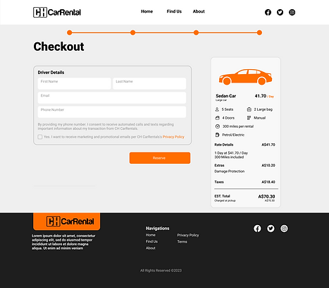.png)
3. Choose Vehicle
-
Implemented a helpful status bar at the top.
-
Considered adding more clarity to 'most popular'—perhaps indicating how many people have used it specifically for this car.
-
Enhanced the user experience by facilitating easy comparison of multiple options, reducing the need for excessive scrolling.
.png)
4. Extras
-
I've ensured a more descriptive title is in place.
-
Also, made sure to include the price.
.png)
The main challenge was time. Had to really brainstorm the right moves and actions to efficiently reach my goal.
-
wanted more interviews with our target audience to really get the lowdown on when and why they travel, instead of just guessing.
-
I talked to users in interviews to figure out what car factors mattered most to them, so we could make those the key filters.
- Have to check if using car icons or actual images works better for users in finding what they want through A/B Testing
3. Research plan
"After presenting the initial design, the client opted for a change to a static webpage format, prioritizing phone orders. Subsequently, I redesigned the interface according to their preferences."
.png)


ECOMMERCE APP
Premium Bicycles and Accessories
iOS App
Overview
The purpose of this mobile app design was to create an easy-to-use application that allows you to purchase cycling goods quickly and easily. Minimalistic product photos are the main focus of this design.
For ease of use, I used familiar oval shapes and provided enough free space to allow for quick reading. To emphasize the modernity of the application, I chose a neutral color palette of dark green and white with neon green accents.
ONLINE STORE
Gold jewellery making business Landing page
Web Design
Overview
This is an e-commerce landing page. By visiting the page, you can get a better idea of what the seller is doing.
However, this time I would like to show you the animated version of the page. I wanted to create a parallax scrolling design that is attractive to look at and a pleasure to use. Additionally, I used AI-generated images to create this conceptual design.


SOCIAL APP
Interactive Social Media Reaction Icons
iOS App
SOCIAL APP
Hover effect for special event
iOS App
Icon Designs
Icons are so powerful and universal that we instantly recognise that they represent a brand, product, or message, without the need for any words.
Icon Design Brief
Business person silhouette type icons for presentation
For a strategy presentation for a corporate client we need 6 icons that look professional yet descriptive of the six topics at hand:
1) Listen into (heart of ) an organization (want to have stethoscope type tool used as part of icon)
2) Bring in outside experts where appropriate
3) Help align interests between different teams (so they go for the same goals/ mission)
4) Identify value opportunities
Target Market(s)
Audience: corporate client, "high touch". Icons need to look professional and "high end", not like the ones I did with 3D figures.
Requirements
Icon style: silhouette of business people (see schematic icons in attachment). primary color blue (12/66/115), accents red (199/7/57). Each icon should have accent. Use of both genders.
Icons
Icon Design Brief
Software application icon design
GOAL
We’re seeking an updated icon design for a new version of our application, LockDown Browser. The desktop icon for the existing version of LockDown Browser is attached. Some users may have both versions installed on their computers, therefore we need an icon for the new version that will allow users to recognize it is the same application but be able to differentiate between the two versions when they see them on their desktop.
GENERAL INFO
LockDown Browser is a custom web browser that locks down a student’s computer while they are taking an online exam. After the student installs the application, this icon will appear on their desktop, where they will access the program in order to take an exam.
ELEMENTS
It should include a lock (in the locked position), preferably a padlock style (not a lock and key). Colors are flexible, but should not use the color in the existing icon. We would like the new icon to have a clean, modern look and feel.
SPECS
File supplied must be 256x256 px. PNG 32-bit (24 bit color + 8 bit alpha blending transparency) is the best format. The icon will be used for Windows, Mac, and iOS.
Original version icon is attached for reference.
Target Market(s)
Students and faculty in higher education
Requirements
Must have
-
Design including a lock.
-
File supplied must be 256x256 px. PNG 32-bit (24 bit color + 8 bit alpha blending transparency) is the best format.
Nice to have
-
We'd like a clean, modern look for this icon.
Should not have
-
Should not be the same exact colors as the original icon.
-
Does not need to include the product name (LockDown Browser) or any text.
Icons

Icon Design Brief
Icon Set for Hospital Mobile App
We are needing icons for a mobile app for a hospital. The icons should be in yellow (C 0 M 8 Y 79 K 0 R 255 G 229 B 79 Hex: ffe54f). The icons should not have a background color as they will be used on a blue background..
The icons needed are (Get Care, Find A Doctor, Find A Location, Healthy Living, Classes and Events, MyChart, About Us, Find Your Way)
I am attaching examples but we are looking for creativity and new design concepts.
Industry/Entity Type
Hospital
Icons
Other Icons
Icon Designs for App and Web platforms for Foreign Clients
Icon Design Brief
Hippokrat Medical Organization needs Graphic Desigh for mobile app icon
We are private clinic located in Azerbaijan. We are going to start mobile application for tele -monitoring of brain and heart diseases. For this purpose we need graphic icon design. We would like to see something that reflects brain and heart controlled from distance and communicate physical safety and assurance.
Target Market(s)
patients and relatives of patients with cardiological, neurological and diabetic disorders, patients using smartphones
Industry/Entity Type
Healthcare
Requirements
Must have
-
Project must have picture of brain and heart, a drop of blood and picture of monitor. Monitor inspires that patients following from distance by the doctors. At the last we would like to see heart, brain or blood drop emerging from horizontal liquid monitor.
-
Of course must have our name Hippokrat TeleMetry
Icons

WEB AND APPS ICONS
Banners & Ads
GIF banner ads are cool and interactive – you can create awesome gif banners and make your banner ad stand out from the crowd. Also, you can easily make them interactive so people will click on them.
Banner Ad Design Brief
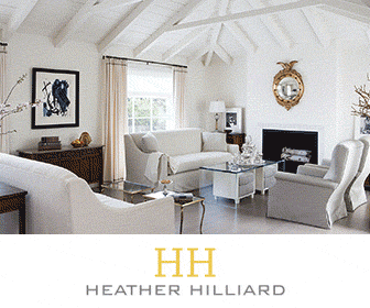
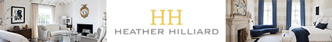
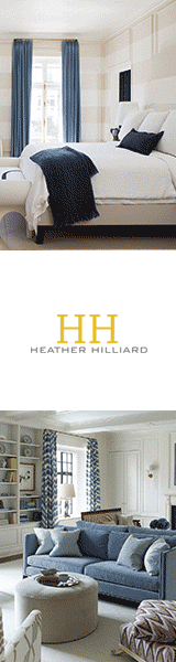
Banner ad for a very high end interior designer
Our website only gets a small number of hits per day, but it is often people looking to choose designers to interview. We are going to do a Google remarketing campaign to show ads to people who have previously visited our website. The goal is to make sure they remember the quality and sophistication of our work.
The banner should include pictures of our work. You can see this at www.heatherhilliard.com. Perhaps a single image per banner, or a slideshow within the banner?
The goal is to create awareness and to remind the former website visitor of our work. So it is important to include the logo from our website in the banner ad for visual anchoring and recall. As well, the banner graphics should be of a quality that would be used by Ralph Lauren or Jimmy Choo or brooks brothers or tesla or Brioni.
As for a 'call to action', we can offer "See Our Work in Person" or some simpler wording. If the person clicks on the banner, it will take them to a landing page where they can request free tickets to the San Francisco Decorator Showcase home. We are designing one of the rooms at that open home event.
Size:
320x100
336x280
460x60
120x600
Banner Animation

Web Layouts
Web Designs for Foreign Clients

WEB PAGES
Social media
Web banners and FB cover designs for Foreign Clients
GIF ANIMATIONS AND COVERS